Saturday 31 October 2009

textures, characters and watering cans...

Friday

interesting lecture with Gareth who showed us a couple of companies who are either 1 or 2 people staff! Jokes indeed but i guess its proof that little timers can do it too. Both showreels demonstrated a high quality of work and whilst they're not perhaps where i wish to take my career, were very interesting to see in terms of what you can do. I spose the concept of garage companies is laughable but then do you really need a studio when so much can be done on your laptop?

heres a few links to their pages:
Shufti Animation has a total team of 1 working on various pieces for creature comforts and bbc, his background is with Aardman. Lots of odd character pieces here!

The Shift is a team of two working on compositing as well as animation pieces. They've won the CG challenge 2 times in succession for their fake trailers, very good showreel here!

I had a quick chat to Gareth about my essay and what i wanted to focus my discussion on which seemed A-OK so i wish to get cracking with this so that I can get feedback on drafts so that i can improve. It will help me to channel the essay more in order to fulfill the assessment criteria. Im gonna focus my essay on the lack of tax breaks for england and how it could potentially starve britian of its industry. It sounds pretty financial but im really interested in where this

walkabouts....

out and about, were set now on setting the scene in the beginnings of autumn....so i took a walk round chislehurst to get a few pictures which will be helpful for the environemnt design/colourings


the early stages of Autumn provide a mix of greens and oranges tones

i love the contrast of the leaves to the grass here, definitely want to include something like this in the environment.


great distressed qualities here, looks like old paper!


and then that very evening this fella turned up...
his name is wilf the woodland wanderer...i need no more gnome paraphernalia else my room will start looking like a shrine to the gnomes by Christmas! Hahaha!
However, there are some interesting textures used on this Gnome i'd like to incorporate in our project..

im liking this distressed look on his clothing, its like canvas bandages have been wrapped round him to give the indentations which give a depth/stone look to him.
also am LOVING the scratches on the watering can which again give a distressed, old, faded quality to the object. I think this will work brilliantly when combined with our environment which is set in Autumn.
weekend

made a start on the essay for Gareths Animation Business unit which Im pleased about as starting essays has to be the worst part but once you get going its ok. Will continue this and hopefully have a first rough draft ready to show for the formative session next week (?)

I also worked solidly on the characters as well as my thumbnails for the story. I have now completed a few design drawings that demonstrate the models flexibility as it was a question raised so obviously its needs to be demonstrated so everyones fully aware of what the characters should be able to do. I've sketched the characters from a few angles to get an idea for their model sheets which i aim to have complete over the next couple of days. Lady Gnomes model sheet is now complete so just the other 2 to go.
This week i think we need to focus on the storyboarding and environment, the characters are now bascially sorted which im pleased about. Texturing is going to require a lot of focus too so were certain how we wish to proceed when it comes to production. The colourings need to be locked down so that a colour script can be formed.


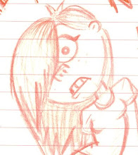
A couple of character poses of Lady to demonstrate her models capabilities as well as her character:

The many faces of Macho. Again lots of possibilities here in order to refine the design of character and pose him accordingly:
a few character poses of Macho which should demonstrate the 3d models capabilities in squash, stretch and muscles for his arms but retaining a fluid smooth quality:
The many drawings of Hero, its given me a good opportunity to really refine the design and test out all possibilities as well as pose him in order to get a better idea of his character and what the model should be able to do in 3d:
a few tests of the few favourites of Hero in 360 poses. I was also testing to see how the face should emerge from the gnome suit.
Character development. Below are a series of skethes for each chaeacter experimenting with ther look in 3d from different angles. I also refined how their faces should appear from their suits and the defining facial features. Hand designs are complete and (on Lady Gnomes page) a few example sketches of the models flexibility as i know this was a question asked by the group:


I think it was one of my first blogs that foolishly said i didnt want to digress from my original designs too much. I dont think these have, im abslutly chuffed with the look of them but you can see the progression and development of them. I think these designs hold much more interest and appeal than my initial ones used for the pitch.
Lady Gnomes model sheet complete :) after a discussion with Matt, were going for characters with 3 fingers instead of the realistic 4 fingers. Will get on with the rest of the model sheets this week.
For rough concept i think we can basically take all our character stuff and place onto photoshop pages and adjust accordingly, not a lot of work there but please make a start on your display pages as it does take some time to do!

Matts been doing some more texture tests which are starting to achieve some of the looks the piece needs, not quite there but then it was inevitable it would require lots of tests and tweaks. However, once we know the elements that construct our painted world, we'll be able to adjust and apply to all the objects/characters etc with ease. I've made a replacement watering can for you to continue your experiments with Matt, as I feel we cant get past the other models look to know if the textures are on the right lines or not. I shall give this file to you Monday to experiment with.
It was good to get back into Maya again...even if it wasnt for long! Model below is based on my prop concept art.
good old occlusion...

Thursday 29 October 2009

meet the characters...

the final 3 take centre stage...introducing Macho, Hero aaaaaand Lady:

Tuesday 27 October 2009

up and character development...

i found a few Up concepts that might be some inspiration to our piece. Some nice colour work that really shows off the different characters in the film. I especially like the old paper look as if these are old articles/magazine issues for you to collect. The old paper look gives the pieces more depth instead of being painted perfect. These may help inspire our own promotional materials as well as concept for this terms pre production unit:

wonderful painting of the sky here, really love the colours the artist has managed to capture the perfect sunset.
brilliant piece of concept here that i reckon they should have used for a promotional piece. It just outlines what the stories about and the goals of the characters, i also like the use of silhouette here and again amazing colour work.
and then when i came home, i found this....

some stills from Up (i've a feeling its going to be a massive influence/piece of inspiration) to demonstrate the look i would like to capture with the grass in our scene. I like this first shot which shows the grass being quite short and patchy as well as a few dotted around stylised plants.

grass heights could differ within the environment as demonstrated here when Carl runs between the kept and unkept houses, it adds a lot more variety to the scene.
Autumn - i think its the way to go with the time of year for our scene, theres just so much colour you can have within the environment and it doesnt necessarily mean dead and dull as theres still lots of fresh greens around. Again it breaks up the scene and provides lots of audience interest.
These two shots are interesting to look at in terms of change from spring/summer to autumn, the sky and lighting also adds a lot to the atmosphere here which is something we need to consider. Again im really liking odd plants/flowers dotted around the scene.

in the mean time i've been developing the characters even further. Lady gnome in particular had the most amount of feedback concerning her not looking feminine enough. The comments stated that she needed some defining features that would show she was female. She was a tricky one to get right but i think i've cracked it...

the puppet drawings are from previous experiments. Here you can see i mostly continued the shapes that the two guy gnomes had but added items such as prints and patterns to make her look more feminine as well as give her hair which popped out of her suit. she still seemed not quite right though...

i showed the previous drawings to Yaniv for some feedback and he said she didnt seem to fit her shape quite right and perhaps needed some alterations. So, i added some curves....


looking much better! When i was drawing her, i sort of imagined her as a Red Riding Hood type with her flowing suit. Her hat point is tapered backwards as if her hairs inside, it looks sort of like a pony tail. Im really pleased with these designs and shall continue experiments for the otehr two to make sure we've tried out lots of variations.

Monday 26 October 2009

the formative

todays formative with Mike went well, we discussed our individual contributions so far as well as how the group were working. Our work is all posted up on our boards so we were able to show Mike the latest stages as well as how our idea had developed over the weeks.
Mike expressed interest in the bullet style gnomes i designed so Im convinced that this is the way to push the design, and i've agreed to develop these further so they are the best they can be and will transfer to Maya effectively. Mike was pleased with our progress and commented that were on schedule to meet the final deadline in week 9.
With story complete we've now split the script up between the 3 of us and will spend the week beginning to thumbnail the boards ready for next week when Dave Bull and Mike return to go through our progress. Im pleased with the groups progress in terms of exploring and experimenting, now its time to lock off choices and produce some finished concepts to show during our next pitch.
Adam has been given the environment to design which needs locking down in order to get a full set design and prop list ready as this is something i plan to freelance out since my team will focus on the characters. discussion with mike
Matt will be focusing on developing the textures and colorings for the piece, firstly establishing the characters colours as well as looking into lighting.
where were up to as a group.
With all that in hand, i spent the rest of the afternoon developing lady gnome as she's one whose drawn a lot of feedback for not looking feminine enough so she's my main focus to get correct at the moment.
Well done team, keep up the good work :)

Thursday 22 October 2009

sorting it out BIG TIME

so it was a really good day today
matt came in with a killer script that juuuuuuuust requires a bit of tweak tweak but overall im much happier as its back to simplistic story telling once more. So well done matt on that one as it was becoming a bit of a nightmare to say the least.
The boards are getting plastered with some great concept work which is brilliant especially since were the smallest of groups :) board 3 will hopefully be up soon and will have our thumbnails/storyboards on. So far were doing great job wise and the mood board gigantasorous list is ever growing thanks to the great inspiration suggestions from the team, ive taken note of those and will culminate all the best images into one super mega mood board ready for the second pitch.
in terms of character design i feel happy that i've explored a range of designs and styles in order to find the golden nuggets we will use for our final characters. Overall i think my character designing is going strength to strength and ive really enjoyed coming up with the look for these crazy guys.
adam is sorting it out in terms of environment and came in today with 150 million questions about shots/angles/what we do see/dont see and what sort of items we want dotted round the garden. He came prepared with a few layout plans for me to browse at, make my suggestions and hes gonna improve upon over the friday and weekend ready for monday

overall maties i say were doing jolly good :)

Tuesday 20 October 2009

characters, colours and leaves?!

Monday

i wanted some outside opinion on the colour tests i did on the characters, so i showed Grigsby and he took a couple of minutes to make some alterations to one of my tests...
from this....

to this...
just a touch of de-saturation and it brings a whole new look to the piece which i quite like! stops the characters from looking the typical bright plastic colours and gives them a new level of depth. Something to keep in mind when creating the colour scheme although i was pleased with the previous skin tones. Grigsby's arguement is that each of the characters should have their own colours but limit their palette to perhaps 3 shades e.g 3 varities of green for the hero etc so it breaks up the shapes a little but doesnt overcrowd the character with colour. The 3 of them have to work seperatly as well as together AND within the environment itself so if colours are bright and vibrant it will be too much for the audience to take in, its too busy, noisy and actually quite distracting to the eye. Colours should compliment the piece not overtake it.
Cheers Grigs for the advise, shall take all this on board :)

stuck a colour wheel up on the group board too to help inspire the palette and make links to contrasts and complimenting colours for our characters and the environment. We want the characters to feel part of the world but not look out of place.

Story discussion with Dave Bull
matt had to go back home for some textures for JB whose helping out with grass tests so I discussed story development with Dave and went through my thumbnails with him. He had some initial problems with why Lady Gnome is not alive and the other two are but overall he seemed pleased with the stories progress. The usual questions were coming up with ther story such as the gun and the human hands so its clear to me thats one too many questions being asked by the audience about the story. In short...they should be able to just watch the world they are presented with and not be questioning what they see. He said in order to progress further we need to be able to answer the following questions:


  • are Macho and Hero Gnome real life gnomes and Lady Gnome is just a statue?
  • or are they all real gnomes?
  • or are they all statue gnomes which come alive?
Since im vastly against gnomes that are real i say no, i've always imagined them to be three statue gnomes which come alive in their own world
The human element needs cutting as its again another unnessary element to the story. This story should be about these 3 gnomes in their own world and not bring things like humans into the plot thats just going to confuse matters.

That afternoon i set the guys their tasks which need to be completed for Thursday this week. Everyone is to work on some further story suggestions:
  • the Hero Gnome and specifically HOW he defeats the Macho Gnome

  • how the Macho Gnome impresses Lady Gnome
Myself and Matt will work on character development as we feel they havent really developed much since my original drawings, which might not be a bad thing but at least if we complete as much concept as we can we can say we covered all aspects/variations etc.

Adams focussing on the environment design. We need to know the world thoroughly in order to best design/make use of the space.

Tuesday & Wednesday
The mornings session was a dissertation meeting which provided us with how to breakdown the essay effectivly and what needs to be inlcuded in order to make the best written document we can. It brought it back home how many other units there are to do this year as well as the film. We need to keep the film simplistic in order to make it effective!

The afternoon saw the year discuss more fundraising ideas for the degree show. Its our show so if we want it to be good then we need to start the planning now. Although i took a back seat initially i was well away helping out brainstorm some fundraising ideas as well as help create possible industry contacts we'd like to invite to the show. The year now has a dedicated board for the degree show which we'll keep updated with news/ideas and info. Dan S, Simon, Sam and Dave have been nominated the official class reps but i think the more the class helps the better the end result will be.

Long old day...came home and got on with some character designs:

heres a few that i started with and theres a mass of range going on here. I tried some noddy types as well as basic shape ones. My only concerns from basic shapes is that they will look too primitive once transfered to Maya....
there was some odd designs going on here which was great from the dr seuss types to the basic block like designs. I started thinking about the characters as a sort of gang with some recurring featuers among them. I started shortning and condensing the designs to their simplist forms...

Some weird beard designs. I then started thinking how you could reduce the character to one basic shape. I came up with a simplistic form as if the hat was the whole body, like a baby suit!


I really liked the little bullet style gnomes so i decided to develop them furtehr to create the 3 characters for our story. They're more condensed yet much more stylised than my previous designs. Theres a quirky unison to them yet they all portray their individual characters. Ideally, i'd like a feature of each to be different to convey the different characters e.g. Hero Gnome has the buttons, Macho with the open shirt and Lady with the frilly flower dress. Heres what i got...


These two were aimed at being more rag doll like, as if they were childrens toys. I quite like the dumpy legs that lead into the feet but we'll see what the group says tomorrow.


taking a break from story and character designing, i decided to scan in a few leaf examples. As its Autumn, the colours of nature are going through weird and wonderful transformations. It defiantly should be something to consider when deciding colour for the final piece, it doesn't just have to be green because its based in the garden. I found some really great examples of leaves that show an almost painted, dip dye, patterned effect of colour change.