Thursday, 25 February 2010

Meeting: Monday 8th March

Right guys, so dissertation hand in is Friday 5th 4:30pm. A massive chunk of time has been taken out of production so we are behind schedule and need to pick up the pace massivly in order to make this mother of a film.

in other words...were gonna have to go full steam ahead now. There are no other units so full focus guys, full focus.

For Monday 8th i need to see the following

Matt, Sarah, Yaniv - All 3 characters modelled and UV'd (though Lady and Hero need discussion about their faces but other sections can be UV'd ready

Matt - The texture tests complete for the characters - stone overlay, colour etc
- texture tests for plants/leaves, ground.

Adam - The environment created - floor, neighbourhood, fences. BEGIN UVING
- Camera playblasts within the 3D environment - at least half the animatics worth

Tom - All elements modeled from your list. Begin UV mapping these.

Heres how i see the week panning out...

The animatic is created in 3D either basic keys on Blocks or characters.
The characters eyebrows need sorting and will be sorted - UVing on characters complete
Characters will be scaled to each other as well as the environment.
Final painted base texture will be locked down - offset and layered ready to alter for ANY and ALL objects within the film.
Matt will take over on texturing of characters
Sarah will begin rigging of the characters
Yaniv, Adam and Tom will continue UVing the other elements for the film with Yaniv working on the main stage area, Adam on the shrubs and Tom on the background houses and elements.

dont forget formative 11th!!!

Wednesday, 24 February 2010

partly cloudy....partly unsure

I still dont see why the showed this in some cinemas and not others. The pixar shorts have always gone hand in hand with their feature films, yet this seemed to have a strange level of mystery around it.

The concept already put me off...the creation of the world thing/where do babies come from ideology seems....somewhat not Pixars style in all honesty...lacking that certain ooo i dont know what. I didnt want it to deter me, as someone whose faced initial criticism of an idea that has often struck people as odd or off-putting...but...when I finally saw it a few days ago I was left disappointed. I cant quite explain it though, the clouds themselves (an obvious technical test for Up) were wonderfully created with a lot of depth, giving a soft fluffy quality to the characters. The lightning was great. The stork that always gets hurt by the more non cuter animals of nature fine....yet it was missing something, something to give it that spark which annoyed me incredibly. It just didnt make me react, i didnt laugh or squerm at the storks pain NOTHING! Is that the answer for unappealing characters? Like i say, I remain uncertain.

My favourite Pixar short still has to be Presto. Maybe its the characters that have more appeal...presto already has this great role reversal between master and servant, that twist of control...maybe its just a funnier concept whereas Partly Cloudy tries to be more subtle in its humour...all i can say is I prefer Pixar making shorts that punch me in the face with humour with superb exaggeration in animation, which is what Partly Cloudy doesnt do for me...sorry

Firstly...heres partly cloudy:

"Partly Cloudy" by Pixar from Jeni Starick on Vimeo.

Presto...the benchmark (for me) of their shorts...

Wednesday, 10 February 2010

The Lady and the Reaper

Frankly is there anyone who hasnt seen this and thought WOW?!

well...if you havent...check it out here:

The lady and the reaper tells the story of the fight over life and death...quite literally...as a Gaston like Dr and Death battle it out over an old ladies soul spinning the story over a chaotic scene of filing cabinets and staircases. The perfect battle, very very funny with excellent pacing and story beats.

The framing was superb throughout...some really interesting angles used to emphasize the drama and anticipation, especially in this starting shot which is a favourite of mine:
another great use of framing through the characters positioning here, the scythe drawing our attention to lady. The use of colour filters and lighting is awesome!
the obnoxious doctor and his nurses. This use of expressive sounds for voices are how are characters are gonna be...this guy IS macho gnome!
I love the character of Mr Death, his simplistic cubic design provides a highly expressive character for the story...a very stylistic view of the skeleton.
The stages had an interesting warped feel throghout which created interesting sets which otherwsie would have been massivly boring if built straight. The storyboarding of shots must have been very thorough in order to know exactly how the sets could be warped and still be functional for the performances to occur.
Use of silouette was also great as it introduced a lot of play with colour here as we decend into the madness of the chase scene...
oranges here showing emphasizing the energy of the scene as the story reaches its emotional peak...
and the blue as the pinicle moment happens and we return to the calm/solution...
Another favourite shot. This is a great set up for an establishing shot and a great design for Mr Death's environment.

the secret to success

"the aim is to collaborate with individuals who work towards a common goal, only then will you journey together towards success..."

heard this on the radio months and months back...i cant remember who said it but the words are incredibly true.

Tuesday, 9 February 2010

how tall is the little fellow?

quick render test to show development of Hero's corner + photoshop character to determine just how tall are these little guys...

1. He's a giant gnome! too big i think


2.
3. Personally i think this is too small but hey, just for contrast. I think his height lies somewhere between 2 and 3...bearing in mind the others are also taller than him.

Wednesday, 3 February 2010

to do list...

List of what I need to model/finish off modelling:
Fork
Flowers - heros + 2 others for his side of the garden
Fishing Rod
Trees - sort em out
stump - again...sort it out
Leaves - give depth to, adjust with lattice
Lady Gnome - finish that mother

Hero's Prize Flower
I didn't want the flowers to resemble realistic flowers, but more have qualities of them with a twist. Hero's flower in-particular needed to resemble something of distinct value, its precious to him so therefore should look pretty different from the other flowers in the garden. I tried designing purely from my head but looked through a few different books until i found a few elements i wanted to encompass into the design.

in the beginningt: I like the petals, but the central part needs something more....im not sure whether i prefer it squared...
as opposed to smooth?
Using the lattice tool to give more definition to the petals, addition of stomas for the centre which need lengthening and more separation between each. Need to vary the petals as its too symmetrical but defiantly getting there.
Model smoothed...not liking the flower smoothed to be honest...

Fishing Rod
I attempted this as more of a square design, but it looked very primitive. So starting again and extruding from a cylinder to create this.

The Weed:
To the left is the plant extruded from a cube works well when it comes to stylising it however looks primitive once smoothed and beveling adds not a lot to the model really. To the right is a version of the plant modelled from an extruded cylinder which gives a cleaner outline HOWEVER its branches look generally rubbish unsmoothed and smooth as you can see....

unsmoothed models...
smoothed...
extruded cube model with added geometry (right) so it retains a more squared off shape when smoothed (left)
Close up of the leaves...as pointed out by Adam, the shapes are fine but the depth needed addressing otherwise they would look extremely primitive. These have been extruded slightly to give a nice curve when smoothed.
Leaves are shaped into position using a lattice...
The Petals....started out as a extruded cube then using the lattice tool to give the geometry curvature.


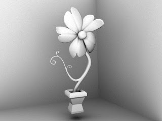
Flower numero deux....one final flower to go along with the troop of plants in Hero's little garden, less wow factor than the prize one but hey still pretty magnificent to say the least.

left: unsmoothed model, right is model smoothed.
Original petal modeled from extrdued cube...

the petals in their lattices are then curved into desired shape and the copied over to create the new flower...(i think my favourite new tool for this term!)
When it came to adding the flower, the stem seemed way too tall and made the flower look a bit obsolete so i changed the shape about a bit and moved and sewed the preferred stork to its new position to get the following...

Model unsmoothed...lower petal needs twisting a bit to fill the gap more. That pot is WAY too tiny. Needs a central point to the flower as the petals gather to nothing at the moment.
added centre piece...

smoothed

The Fork:
Ok, there have been previous attempts at this model and along with their positives came a whole load of negatives which when we broke it down, came down to the prongs on the fork. Although squared off, stylized they looked unbelievably underworked, lame and genuinely not conveying the practical element of a garden fork. Along with stylization comes a believability in the item, the audience has to believe it could be used and maybe they would...but they would believe it was a primitive fork none the less. This prop is KEY to the story, therefore needs to look killer...

SO...taking the good points, i spent many hours looking at a garden fork to redesign this in maya...

not bad...proportion wise not quite long enough but not bad. More details from the handle to the stem to the base give us more information....
lengthened...got rid of the ridge bit between the prongs to make a more solid object....
which prongs do you prefer?
Showed the guys and the preference was for the fork prongs to the left as it looked much slicker, so I'll continue with that one, adding in a nice curve to the shape that garden forks have.

left: original fork, middle: new fork unsmoothed, right: new fork bevelled and smoothed....need to sort out that middle prong.

Heros Corner:
Just to get a quick idea how the environment is building up....these are the unbevelled pots and models are unsmoothed but frankly still looking rather swanky...grass patches and tufts as well as leaves will need to be added when dressing the set. EDIT: after showing the guys, the second flower needs to be reduced in height/size as its dominating as much space as the prize flower...will alter this accordingly.

Machos Corner: another render test to see the props possible layout for Machos corner of the garden...less curls and swirls and more grafting. Again lots of grass patches and tufts and addition of leaves required in set dressing...


The Trees: after much discussion it was decided the design needed redoing. The trees that were originally designed, though stylistic were too big for the environment in which the story is set. They're the kinda trees you'd find in the vast woods with frodo baggins instead of the humble garden with the quaint little gnomes (yes i said quaint....what of it?) Anywho i looked into my garden, my neighbours garden, then had a staring match with the neighbours becuase of the whole looking into their gardens, then a redesign of the trees so they embedded the curly qualities of our flowers:

Tuesday, 2 February 2010

watercolour testing

ok matt i'm gonna give this painted textures a wee bit of experimenting

3 basic colour layers in photoshop, grain, paint effects, texture added via filter effects
every paint splat is on its own separate layer and hue/saturation/lightness adjusted accordingly to allow the most control.


tues-er-mc-day

pressing on with character modelling...

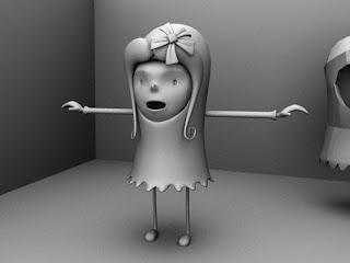
from ze side...loooking good...hair might require pushing back further at its top section though...that or the flower. dress frill still needs adjusting.
from the front...ive reduced the width of her lower face slightly as it looked too puffy. looks a bit more slender/femine now. nose is still looking about michael jackson but i shall continue to tweak.
A quick test of her with duplicated arms, legs etc....left part of hair isnt currently latticed into place. Looking much better but still a few areas to adjust.
left side of hair now latticed into place, bent and curled to give more dimensions.
added a bit of length to her legs to give her a bit more of a slender/feminine look....dress frills have been curled outwards but still need etc work as they look under-worked and lose their shape when smoothed.