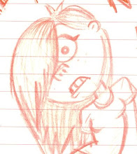
Its awards time and the following have been awarded worst email usage at the weekends...

Painting the pots. Wanted to try and capture a dusty terracotta look here which i think is starting to work but needs a few more tweaks etc. The pots are ok but again havent spent more than 15 mins on colouring these...seriously quick with throwing the old paint about...its all about being messy and loose with the design...no definitive structure.
Painting the stomas? (im not a flower expert) for Hero's Orchid...i began by roughly painting and then applying the texture to see how it stretched and then removing colour with the poly lasso tool to neaten it up. We wont see super close to the flower but just so the geometry makes sense.
 Lambert 1 making a disappearing act there off the top petal...nice.
 Flower deux...Once i mastered one petal it was simple enough to transfer over all the layers to the other petals. These arent symmetrical tho as ive tweaked opacity, sizes and duplicated/removed layers to make each of the petals unique. Flowers are random so i figured why not...

Flower numero deux has taken a bit of a leading role...unintentional i can assure you, but i think we might have to change numero deux to be Heros flower. Whilst i was aiming for a tropical feel with the real Heros flower, i think the purple colourings really contrast with the rest of the garden making it stand alone as something individual. Im so happy with the texturing on this too i think it deserves to be centre stage...will discuss with the guys tomorrow on this one to get their ideas. The stems are looking ok, possibly more work in variation of splats etc is needed but you have to be careful not to start making it look like army camoflague!


Wow, these are looking gorgeous, nice one!!!
ReplyDeleteI think you're right that the second flower has taken over as the main flower, but i think regardless of what you do to the primary the secondary is going to stand out, cuz theres no dark blue or purple in our scene so the eyes gonna be drawn to this flower. No matter though cuz it looks awesome.
Being the unsatisfiable git that i am though there are a few small(and i do mean small)things.
On the bottom image i would make the two flower stems the same colour as the blue flower stem.
I think the flowerpots may need to be a little richer in colour(though this may be down to lighting).
And the centre of the blue flower is a little too bright in its yellow, it contrasts ever so slightly with the darker yellow on the petals.
I might get you to do the leaves textures whilst i work out the UV sets, cuz based on this you'd do a MUCH better job than i would.
Other than that the only real texturing thats gotta be done is grass blades and rocks...but we'll worry about that later.
Really nice work here Sarah, we keep this up and its gonna look fantastic.
You seem to have a real knack for everything 2d and pre-production. One of the best in the class I reckon. Keep up the good work, and thanks a lot for your PPD help, would have completely missed the deadline without you.
ReplyDeletecheers matt and yaniv!
ReplyDeletei shall make them there changes