
Monday
i wanted some outside opinion on the colour tests i did on the characters, so i showed Grigsby and he took a couple of minutes to make some alterations to one of my tests...
from this....

 just a touch of de-saturation and it brings a whole new look to the piece which i quite like! stops the characters from looking the typical bright plastic colours and gives them a new level of depth. Something to keep in mind when creating the colour scheme although i was pleased with the previous skin tones. Grigsby's arguement is that each of the characters should have their own colours but limit their palette to perhaps 3 shades e.g 3 varities of green for the hero etc so it breaks up the shapes a little but doesnt overcrowd the character with colour. The 3 of them have to work seperatly as well as together AND within the environment itself so if colours are bright and vibrant it will be too much for the audience to take in, its too busy, noisy and actually quite distracting to the eye. Colours should compliment the piece not overtake it.
  stuck a colour wheel up on the group board too to help inspire the palette and make links to contrasts and complimenting colours for our characters and the environment. We want the characters to feel part of the world but not look out of place.
Story discussion with Dave Bull
matt had to go back home for some textures for JB whose helping out with grass tests so I discussed story development with Dave and went through my thumbnails with him. He had some initial problems with why Lady Gnome is not alive and the other two are but overall he seemed pleased with the stories progress. The usual questions were coming up with ther story such as the gun and the human hands so its clear to me thats one too many questions being asked by the audience about the story. In short...they should be able to just watch the world they are presented with and not be questioning what they see. He said in order to progress further we need to be able to answer the following questions:
- are Macho and Hero Gnome real life gnomes and Lady Gnome is just a statue?
- or are they all real gnomes?
- or are they all statue gnomes which come alive?
Since im vastly against gnomes that are real i say no, i've always imagined them to be three statue gnomes which come alive in their own world
The human element needs cutting as its again another unnessary element to the story. This story should be about these 3 gnomes in their own world and not bring things like humans into the plot thats just going to confuse matters.
That afternoon i set the guys their tasks which need to be completed for Thursday this week. Everyone is to work on some further story suggestions:
- the Hero Gnome and specifically HOW he defeats the Macho Gnome
- how the Macho Gnome impresses Lady Gnome
Myself and Matt will work on character development as we feel they havent really developed much since my original drawings, which might not be a bad thing but at least if we complete as much concept as we can we can say we covered all aspects/variations etc.
Adams focussing on the environment design. We need to know the world thoroughly in order to best design/make use of the space.
The mornings session was a dissertation meeting which provided us with how to breakdown the essay effectivly and what needs to be inlcuded in order to make the best written document we can. It brought it back home how many other units there are to do this year as well as the film. We need to keep the film simplistic in order to make it effective!
The afternoon saw the year discuss more fundraising ideas for the degree show. Its our show so if we want it to be good then we need to start the planning now. Although i took a back seat initially i was well away helping out brainstorm some fundraising ideas as well as help create possible industry contacts we'd like to invite to the show. The year now has a dedicated board for the degree show which we'll keep updated with news/ideas and info. Dan S, Simon, Sam and Dave have been nominated the official class reps but i think the more the class helps the better the end result will be.
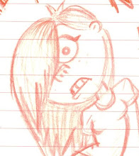
Long old day...came home and got on with some character designs:
heres a few that i started with and theres a mass of range going on here. I tried some noddy types as well as basic shape ones. My only concerns from basic shapes is that they will look too primitive once transfered to Maya....
.jpg) there was some odd designs going on here which was great from the dr seuss types to the basic block like designs. I started thinking about the characters as a sort of gang with some recurring featuers among them. I started shortning and condensing the designs to their simplist forms...
there was some odd designs going on here which was great from the dr seuss types to the basic block like designs. I started thinking about the characters as a sort of gang with some recurring featuers among them. I started shortning and condensing the designs to their simplist forms....jpg)
Some weird beard designs. I then started thinking how you could reduce the character to one basic shape. I came up with a simplistic form as if the hat was the whole body, like a baby suit!
.jpg)
I really liked the little bullet style gnomes so i decided to develop them furtehr to create the 3 characters for our story. They're more condensed yet much more stylised than my previous designs. Theres a quirky unison to them yet they all portray their individual characters. Ideally, i'd like a feature of each to be different to convey the different characters e.g. Hero Gnome has the buttons, Macho with the open shirt and Lady with the frilly flower dress. Heres what i got...
.jpg)
These two were aimed at being more rag doll like, as if they were childrens toys. I quite like the dumpy legs that lead into the feet but we'll see what the group says tomorrow.
.jpg)
.jpg) taking a break from story and character designing, i decided to scan in a few leaf examples. As its Autumn, the colours of nature are going through weird and wonderful transformations. It defiantly should be something to consider when deciding colour for the final piece, it doesn't just have to be green because its based in the garden. I found some really great examples of leaves that show an almost painted, dip dye, patterned effect of colour change.
taking a break from story and character designing, i decided to scan in a few leaf examples. As its Autumn, the colours of nature are going through weird and wonderful transformations. It defiantly should be something to consider when deciding colour for the final piece, it doesn't just have to be green because its based in the garden. I found some really great examples of leaves that show an almost painted, dip dye, patterned effect of colour change.
.jpg)
.jpg)
.jpg)
.jpg) taking a break from story and character designing, i decided to scan in a few leaf examples. As its Autumn, the colours of nature are going through weird and wonderful transformations. It defiantly should be something to consider when deciding colour for the final piece, it doesn't just have to be green because its based in the garden. I found some really great examples of leaves that show an almost painted, dip dye, patterned effect of colour change.
taking a break from story and character designing, i decided to scan in a few leaf examples. As its Autumn, the colours of nature are going through weird and wonderful transformations. It defiantly should be something to consider when deciding colour for the final piece, it doesn't just have to be green because its based in the garden. I found some really great examples of leaves that show an almost painted, dip dye, patterned effect of colour change. .jpg)
No comments:
Post a Comment