
i found a few Up concepts that might be some inspiration to our piece. Some nice colour work that really shows off the different characters in the film. I especially like the old paper look as if these are old articles/magazine issues for you to collect. The old paper look gives the pieces more depth instead of being painted perfect. These may help inspire our own promotional materials as well as concept for this terms pre production unit:


 wonderful painting of the sky here, really love the colours the artist has managed to capture the perfect sunset.
 brilliant piece of concept here that i reckon they should have used for a promotional piece. It just outlines what the stories about and the goals of the characters, i also like the use of silhouette here and again amazing colour work.
and then when i came home, i found this....

some stills from Up (i've a feeling its going to be a massive influence/piece of inspiration) to demonstrate the look i would like to capture with the grass in our scene. I like this first shot which shows the grass being quite short and patchy as well as a few dotted around stylised plants.
 grass heights could differ within the environment as demonstrated here when Carl runs between the kept and unkept houses, it adds a lot more variety to the scene.
 Autumn - i think its the way to go with the time of year for our scene, theres just so much colour you can have within the environment and it doesnt necessarily mean dead and dull as theres still lots of fresh greens around. Again it breaks up the scene and provides lots of audience interest.
 These two shots are interesting to look at in terms of change from spring/summer to autumn, the sky and lighting also adds a lot to the atmosphere here which is something we need to consider. Again im really liking odd plants/flowers dotted around the scene.

the puppet drawings are from previous experiments. Here you can see i mostly continued the shapes that the two guy gnomes had but added items such as prints and patterns to make her look more feminine as well as give her hair which popped out of her suit. she still seemed not quite right though...
.jpg) i showed the previous drawings to Yaniv for some feedback and he said she didnt seem to fit her shape quite right and perhaps needed some alterations. So, i added some curves....
i showed the previous drawings to Yaniv for some feedback and he said she didnt seem to fit her shape quite right and perhaps needed some alterations. So, i added some curves....
.jpg)
.jpg) looking much better! When i was drawing her, i sort of imagined her as a Red Riding Hood type with her flowing suit. Her hat point is tapered backwards as if her hairs inside, it looks sort of like a pony tail. Im really pleased with these designs and shall continue experiments for the otehr two to make sure we've tried out lots of variations.
looking much better! When i was drawing her, i sort of imagined her as a Red Riding Hood type with her flowing suit. Her hat point is tapered backwards as if her hairs inside, it looks sort of like a pony tail. Im really pleased with these designs and shall continue experiments for the otehr two to make sure we've tried out lots of variations.
.jpg) i showed the previous drawings to Yaniv for some feedback and he said she didnt seem to fit her shape quite right and perhaps needed some alterations. So, i added some curves....
i showed the previous drawings to Yaniv for some feedback and he said she didnt seem to fit her shape quite right and perhaps needed some alterations. So, i added some curves.....jpg)
.jpg) looking much better! When i was drawing her, i sort of imagined her as a Red Riding Hood type with her flowing suit. Her hat point is tapered backwards as if her hairs inside, it looks sort of like a pony tail. Im really pleased with these designs and shall continue experiments for the otehr two to make sure we've tried out lots of variations.
looking much better! When i was drawing her, i sort of imagined her as a Red Riding Hood type with her flowing suit. Her hat point is tapered backwards as if her hairs inside, it looks sort of like a pony tail. Im really pleased with these designs and shall continue experiments for the otehr two to make sure we've tried out lots of variations. 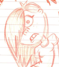
No comments:
Post a Comment