
monday
Fraser was back in to discuss story and the importance of scene layouts/design in terms of telling the story. He showed us a couple of clips from The Emporers New Groove which demonstrated how animations cheat the audience in order to convey narrative. We also focussed on good camera shots and again what they tell us as the audience. Cheating the audience isnt necessarily a bad thing so long as your doing it for a purpose and it doesnt scream out dramatic changes that distract the audience from simply viewing what you present them.
We then discussed character design and how each character should compliment one another and not simply look the same. Characters need to share similar space so therefore the shapes that construct them should reflect this. A good example Fraser showed us was of Mr Incredible and Mr Hough from Pixars The Incredibles....

...you can see how their faces almost join into a complete shape with Bobs full brow shape along with Mr Hough's jaw. This is something we need to consider for our characters as currently they have a some what similar quality. We can possibly push the design more so that each of the characters work with one another as well as alone when sharing space on the set.
Later that day...
Dave Ross has expressed interest to help out on the project which is good news! Currently we dont have anything for him to complete as were still finalizing story and he did honestly say that concept was not his strong point. I imagine we can pull him on board when were into the modelling and texturing stage which will lighten the load off the rest of us. His expertise in rigging in sure will come into use too in assisting us. Thank you Mr Ross!
tuesday
ok so i've been working on prop concepts recently but when it comes down to the gardening tools i think its best if i design just 1 prop for now in as many different ways as i can and then we have a good old group discussion on which style is best to pursue for the piece and then i can tailer the rest of the tools/props round this. The previous experiments aren't wasted as its given me a chance to experiment with a number of different shapes/drawing techniques in order to get me to question what do we really want in terms of stylization within the film.So...without furter a do, i present the family of forks:
.jpg)
at home
matt sent me through a quick texture test he'd created using watercolours and a leaf texture, but things are still looking too realistic for me liking. We dont have to create realistic textures in terms of grains and veins etc we can add elements of our own or completely stylise them in photoshop.
just quickly, ever so quickly mind, i took one of my painted textures on through to photoshop and had a quick play round with its layers, got a few interesting looks
using this texture i created i offset and tiled it in photoshop (rather quickly i might add) to quickly see how the pastel looks on a basic (i repeat basic) model in maya
 i warned you it was basic...turning the quadratic option off allows this texture to be at its clearest ready for when its bump mapped.


 so how would the texturing be done?
 i warned you it was basic...turning the quadratic option off allows this texture to be at its clearest ready for when its bump mapped.
ok so forgetting the maya, heres some layer tests in photoshop. On top of the mushroom texture is a film grain layer with adjusted highlights. Not bad but not overly noticeable.

this one has a glass overlay on top

here ive added a texturiser using the burlap option

the texturiser option again but using the canvas option, its a lot more subtle than the above but again, depends what we want.

here ive added an overlay with an old paper texture which gives a kind of dirty, imperfect quality which is quite interesting.

using the tile/mosiaque option

and finally...with paint daubs
 so how would the texturing be done?
since my last project, which involved created painted textures and from this experiment, its apparent the best option would be to have basic individual colours in the desired median and then create the patterns from there. This gives you more control over the final look instead of just adjusting the texture as a whole.
wednesday
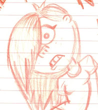
Ive been thinking more about our characters shapes and how they will work together when sharing the space onscreen. After a discussion with Mike Smith today, he suggested getting back to basics and experimenting with the extremes of our characters looks. Ive completed a few drawings to demonstrate this but think i'll have a go at some collages to try out as many varieties as possible.
.jpg) Got some feedback from Yaniv on the Macho Guy (bigger guy!) that he could be seen as quite cuddly as he's quite round and fluid like, hence i've tried a few sharper shaped versions round the edge.
Got some feedback from Yaniv on the Macho Guy (bigger guy!) that he could be seen as quite cuddly as he's quite round and fluid like, hence i've tried a few sharper shaped versions round the edge. later that day i experimented with some card cut out shapes in a variety of three sizes to further experiment with the characters looks and how they will share screen space. Experimented with quite a few different looks and there are clearly some that work, some that don't and some that dont suit character shapes at all. I shall bring these in for the guys to look at tomorrow so we can keep it in mind when developing the characters.
Heres a couple of snaps of the images compiled together:


No comments:
Post a Comment