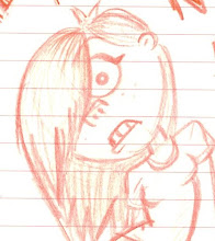
had a long old day at work on the saturday (which my producer can confirm since he was there too) so the sunday saw a rather relaxed session of updating the blog (after my producer had yelled at me to actually publish what i'd been writing)
updating does take a while so i intend to be more prompt with this in the future as it means i can just get down to the work instead of scanning, uploading images and writing etc etc.
managaed to collect a few colour cards that might provide inspiration for our colour palette...
updating does take a while so i intend to be more prompt with this in the future as it means i can just get down to the work instead of scanning, uploading images and writing etc etc.
managaed to collect a few colour cards that might provide inspiration for our colour palette...
I've started some colour test in both pastels and watercolours for environment concepts. At the moment, recreating the look of pond water seems to be a delicate balance of blue and green tones. When a final colour palette is decided, the water will need to be worked on straight away so it can be tweak tweak tweaked so it doesn't look naff!
Below is my compilation of environment research including some photos taken by my boyfriend at a recent visit to Kew Gardens:


Below is my compilation of environment research including some photos taken by my boyfriend at a recent visit to Kew Gardens:


and now for something more vivid! i love the colours used here in Monet's Water Lilies, looks very exciting and fresh. I especially love the recreation of the waters reflectivity.
In terms of designing the set and props I'd like something stylised and not a simple recreation. Think of it in terms of "the idea of something" something which has the elements of say a watering can but not a straight forward bog standard snore fest watering can? Heres some Incredibles prop concepts by Teddy Newton at Pixar to inspire your drawings:
and heres some tests experimenting with different mark making. My aim for the texturing is NOT t have solid/block colour so its important we get experimenting now.
whilst i was experimenting with watercolours and pastels, i searched for some from free texture sites and found a couple of interesting images which we could use for our texturing. the reason im interested in experimenting with watercolours at the moment is because this median is typically associated with paintings of landscapes etc so it might give our characters and surroundings a better atmosphere of being outdoors.


.jpg)
.jpg)


.jpg)
.jpg)


No comments:
Post a Comment